HERRING-
BRANDING AND PHOTOGRAPHY
HERRING is a chic, high quality apparel brand made for women. Characterised by a minimal and strong design aesthetic featuring beautifully made, quality textiles. HERRING is designed for powerful women who have a strong sense of personal style and a desire for nonconformity. HERRING is an exciting brand that stays in touch with their fashionable clientele through a pop-up-store culture and has a permanent, comfortable and accessible home online.
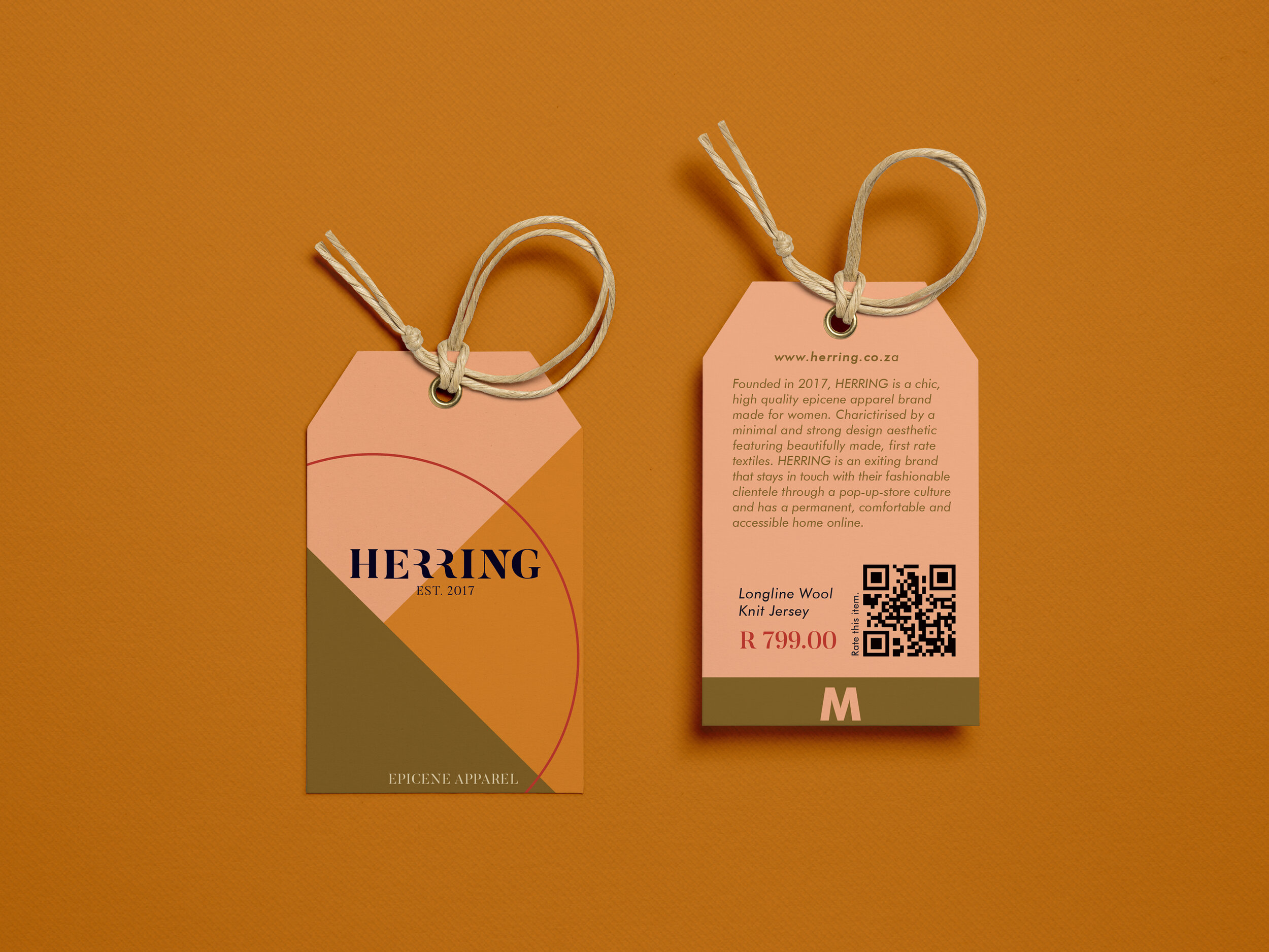
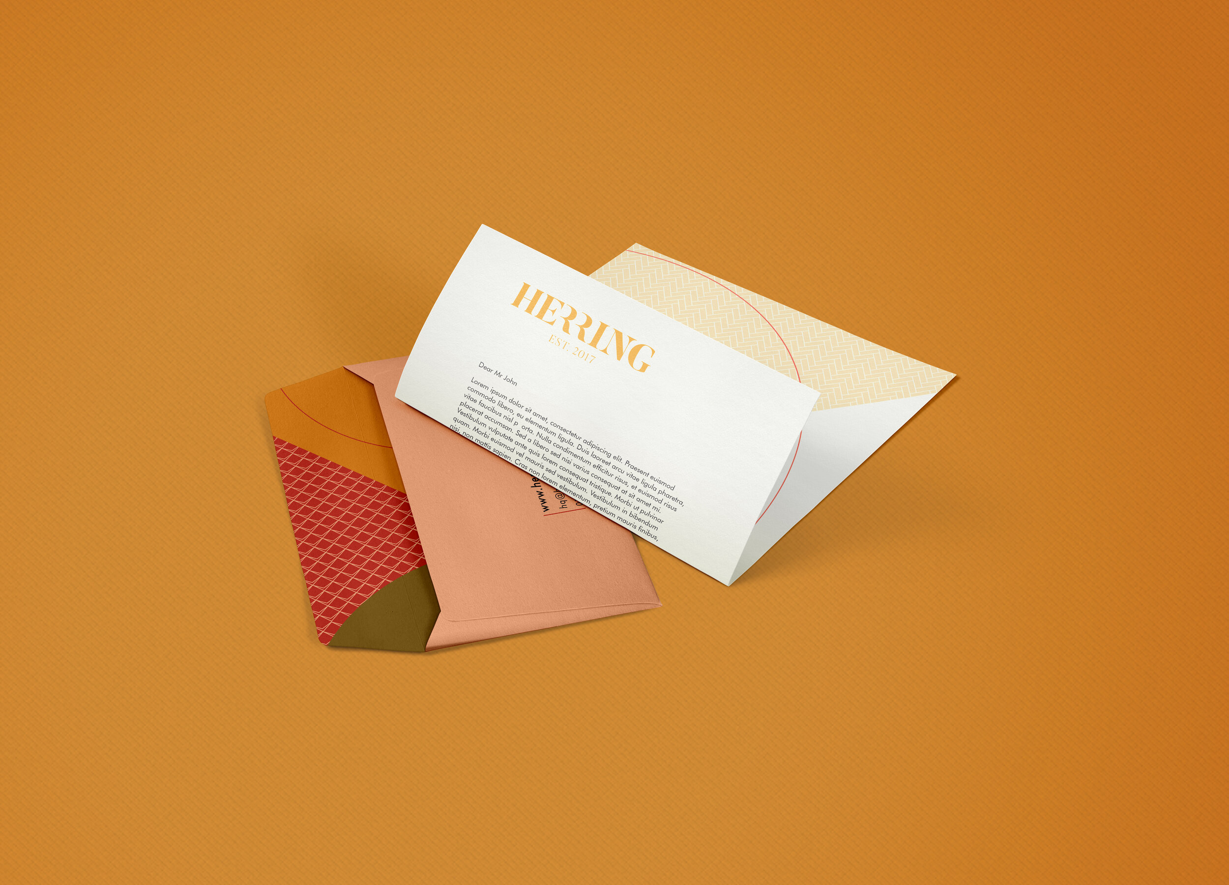
The corporate identity was designed to reflect the characteristics of the HERRING brand. With focus on strong, jewel toned colours and minimal flat vector shapes.


THE LOGO
The HERRING logo is a type based logo. The logo is created from the starting point of the “butler” typeface used throughout the CI. The type was modified to create a more minimal and interesting end result. The two r’s used in the name is striped down to just a simple shape. The phrase “est. 2017” is added in the bottom center of the logo. This phrase added in a thinner font adds contrast to the logo and also prevents the logo from becoming to long.


PHOTOGRAPHY.
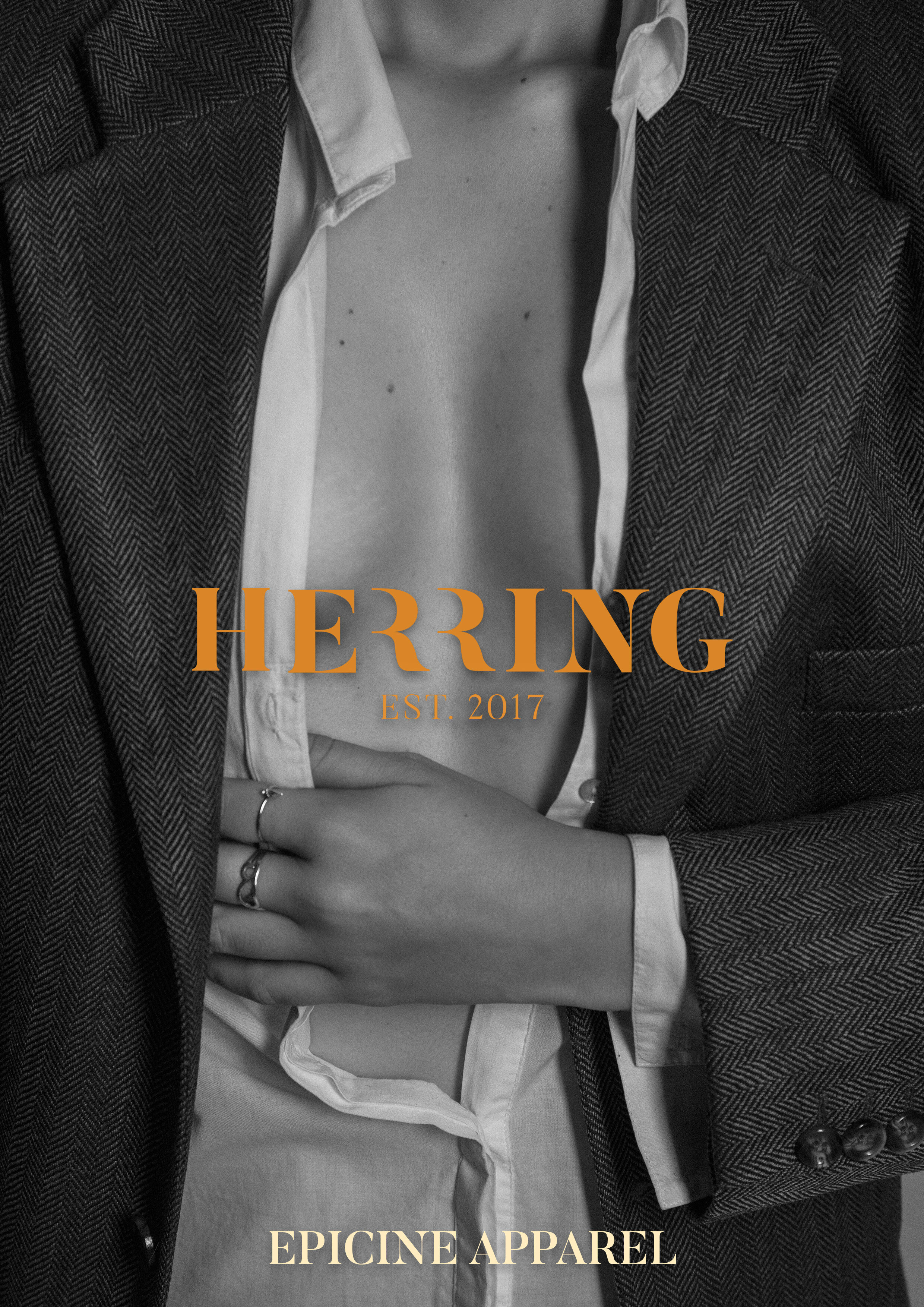
Photographs highlighting the textures and tones of the clothing.


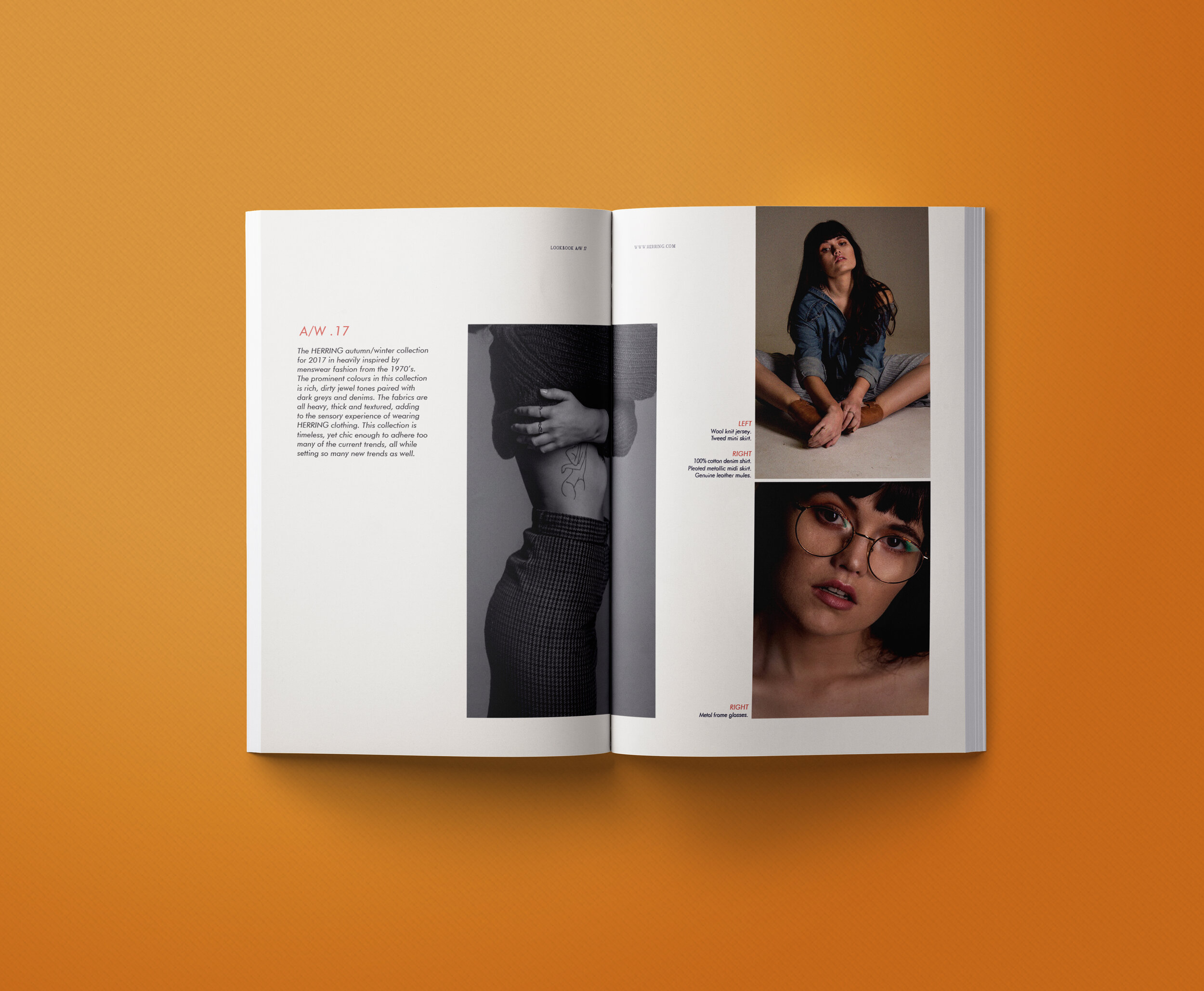
catalogue layout design
A catalogue is used by a clothing line to showcase their pieces for each specific season. The
catalogue reflects the HERRING brand look and feel. The catalogue is used in conjunction
with the advertising campaign to market the brand tot the HERRING client.


